Office 2013 MyITLab MS-Excel Grader Salary Data
As the Human Resources Manager, you maintain employee salary data. You exported data from the corporate database into an Excel workbook. You want to display subtotals for salary by city. For further analysis, you want to create a PivotTable to determine what the total salaries would be if employees who earn an Excellent rating get a 5% increase in salary. Finally, you want to create a PivotChart that depicts what percentage of employees earn each performance rating.
Instructions:
For the purpose of grading the project you are required to perform the following tasks:
| Step | Instructions | Points Possible |
| 1 | Start Excel. Open the downloaded Excel file named exploring_e05_grader_a1_start.xlsx. | 0 |
| 2 | In the Subtotal worksheet, sort the data by Location in alphabetical order and then by Title in Alphabetical order. | 5 |
| 3 | In the Subtotal worksheet, use the Subtotal feature to calculate the average Salary by Location. | 10 |
| 4 | In the Subtotal worksheet, display only the Location averages and grand average. Expand the details for Chicago. | 5 |
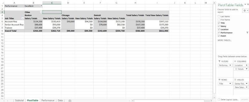
| 5 | Use the Data worksheet to create a recommended PivotTable. Select the Sum of Salary by Title recommended PivotTable. Rename the new worksheet PivotTable. | 10 |
| 6 | Add the Location field to the COLUMNS area and remove the Last Name field from the ROWS area in the PivotTable. | 5 |
| 7 | Modify the VALUES field by changing the custom name to Salary Totals and formatting the values with Currency number type with zero decimal places. | 10 |
| 8 | Set a Performance filter to display Excellent ratings only. | 5 |
| 9 | Insert a calculated field named Field1 that calculates a 5% increase in salaries. The new value should give the total new salaries, not just the increase. | 5 |
| 10 | Modify the calculated field by changing the custom name to New Salary Totals and formatting the values with Currency number type with zero decimal places. | 5 |
| 11 | Type Job Titles in cell A5 and Cities in cell B3. | 5 |
| 12 | Apply Pivot Style Light 15, and display banded columns. | 5 |
| 13 | Use the Data worksheet to create a PivotChart using the Performance field for both the AXIS (CATEGORY) and VALUES areas on a new sheet named Performance. Change the chart type to Pie. | 5 |
| 14 | Hide the field buttons in the PivotChart and change the chart title to Performance Ratings. | 5 |
| 15 | Sort the data in the Performance PivotTable to display the largest number to the smallest number. | 5 |
| 16 | Add data labels to the Inside End position and change them from values to percentages. Group the data labels together and apply bold and 10-pt size to them. | 10 |
| 17 | Adjust the size of the PivotChart for the range A8:D20. | 5 |
| 18 | Ensure that the worksheets are correctly named and placed in the following order in the workbook: Subtotal, PivotTable, Performance, Data. Save the workbook. Close the workbook, and then exit Excel. Submit the workbook as directed. | 0 |
| Total Points | 100 |
- File Format: MS-Excel .xlsx
- Version: 2013