Office 2016 MyITLab MS-Excel Grader EX16_XL_CH03_GRADER_CAP_AS – Movie Source 1.0
-----View all Office 2016 MyITLab Grader Digital Solution Download Files-----
-----View all Office 2016 MyITLab Grader Digital Solution Download Files-----
You are an assistant manager at Premiere Movie Source, an online company that enables customers to download movies for a fee. You need to track movie download sales by genre. You gathered the data for November 2018 and organized it in an Excel workbook. You are ready to create charts to help represent the data so that you can make a presentation to your manager later this week.
Instructions:
For the purpose of grading the project you are required to perform the following tasks:
| Step | Instructions | Points Possible |
| 1 | Start Excel. Download and open the file named exploring_e03_grader_a1.xlsx. | 0.000 |
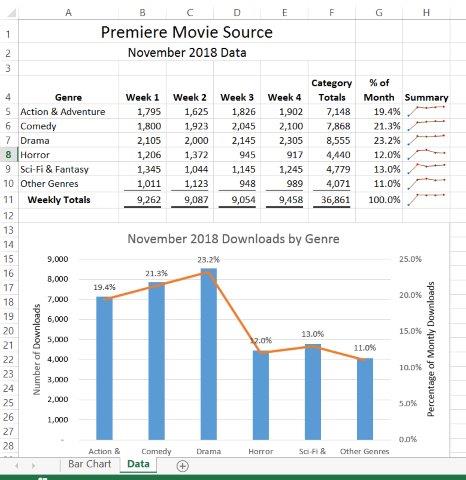
| 2 | Select the ranges A4:A10, F4:G10 and create a Clustered Column – Line on Secondary Axis combo chart. | 10.000 |
| 3 | Position the chart to start in cell A13. Change the height to 3.5 inches and the width to 6 inches. | 6.000 |
| 4 | Change the chart title to November 2018 Downloads by Genre. Apply Black, Text 1 font color to the value axis title. | 4.000 |
| 5 | Add a primary value axis title and type Number of Downloads. Add a secondary value axis title and type Percentage of Monthly Downloads. Apply Black, Text 1 font color to both value axis titles. | 6.000 |
| 6 | Remove the legend. | 2.000 |
| 7 | Add data labels for the % of Month line. Position the data labels Above. | 3.000 |
| 8 | Select the range A5:E11. Insert Line Sparklines in the range H5:H11. | 8.000 |
| 9 | Apply the Sparkline Style Accent 2, Darker 50% sparkline style. | 4.000 |
| 10 | Show the high point and markers for the sparklines. Change the high point marker color to Red. Change the low point marker to Blue. | 8.000 |
| 11 | Select the range A4:E10. Create a stacked bar chart. Move the chart to new sheet. Type Bar Chart for the sheet name. | 8.000 |
| 12 | Add a chart title above the bar chart and type November 2018 Weekly Downloads by Genre. Apply bold and Blue font color to the bar chart title. | 8.000 |
| 13 | Apply 11 pt font size to the category axis, value axis, and the legend for the bar chart. | 6.000 |
| 14 | Use the Axis Options to display the value axis in units of Thousands, set the Major Units to 500, apply the Number format with 1 decimal place for the bar chart. Use the Axis Options to format the category axis so that the category labels are in reverse order in the bar chart. | 10.000 |
| 15 | Change colors and apply Color 12 to the bar chart. | 5.000 |
| 16 | Apply the default gradient fill for the plot area in the bar chart. | 5.000 |
| 17 | Apply landscape orientation for the Data worksheet. | 2.000 |
| 18 | Apply horizontal and vertical center on page options for the Data worksheet. | 4.000 |
| 19 | Ensure that the worksheets are correctly named and placed in the following order in the workbook: Bar Chart, Data. Save the workbook. Close the workbook and then exit Excel. Submit the workbook as directed. | 1.000 |
| Total Points | 100.000 |
Leave a Reply
- File Format: MS-Excel .xlsx
- Version: 2016
Actually, this is a question. Do you have the step-by-step version of EX16_XL_CH03_GRADER_CAP_AS – Movie Source 1.12?
Dear Estela Padron,
Please share the complete details of the project with us at info@libraay.com. We shall arrange for it’s solution for you.
Team Libraay